

.svg "Compliance Council")

Project managers want to know two things above all else; if the project is on budget and if the project is on time. And since there is a limited supply of effective crystal balls on the market, we’ve been forced to turn to other measures. Burndown charts are accessible crystal balls for project management.
Below we explore the application of burndown charts in more detail. We also provide you with a three-step guide on how you can create your own graphs to ensure you’re always meeting those important deadlines.
What is a Burndown Chart?
Burndown charts are graphs that show the volume of work left to complete and how much time you have to do it. Burndown charts include two lines, showing you the “ideal” work amount of work remaining at certain points, as well as the “actual” amount of work remaining. They help teams work towards specific goals to get the entire job completed on time and on budget.
How do you create an effective burndown chart?
Step 1: Make Excel Your Friend
We’ve all had different relationships with Microsoft Excel over the years. Whatever your history, it’s time to put the past behind you, because it’s going to be an invaluable friend throughout this process. Open your Excel sheet and add the headers for your story (effort), tasks (projects) and sprint (time).
Pay close attention to this set up process. Say you have a sprint of 10 days until the project needs to be completed, considering there are two team members each working eight hours a day. You can use the actual dates over this period, or you can choose to start at Day 10 and work your way down to D-Day. It’s up to you, but the latter option often sparks the kind of energy you need at the back end of projects.
Step 2: Use Formulas
You’ll find your renewed friendship with Excel will yield many benefits, such as the program doing all the tricky and cumbersome calculations for you with ease.
Excel can estimate how long this project will take to complete. It does this by calculating the ideal amount of effort required for each worker over each day. And this is filled out by you each day as well. As more work is done, daily required effort “burns down” to zero. This means that your burndown chart is displaying both the ideal lines and the actual lines. And this can help you adjust your processes to maximise productivity and efficiency.
Step 3: Select the Data
Now you’re up to the easier part. Create a template and select the data.
There should be a clear graph displaying the ideal remaining effort and the actual remaining effort in two rows. Select a chart which you prefer, but we suggest you use a line chart because it’s the easiest to visualise the data. Add titles for your axes and the lines and you’re good to go.
Each project has a number of different tasks which need to be completed before work can proceed. Further, unfinished work costs money and upsets clients, especially when deadlines aren’t met. Burndown charts ensure you’re on top of your projects. They give you an insight into the future and allow you to change your practices, making sure you’re always getting the most out of your team.
To get in touch with a Compliance Council compliance consultant, or for more information on reaching ISO 9001 compliance, leave us a message below.
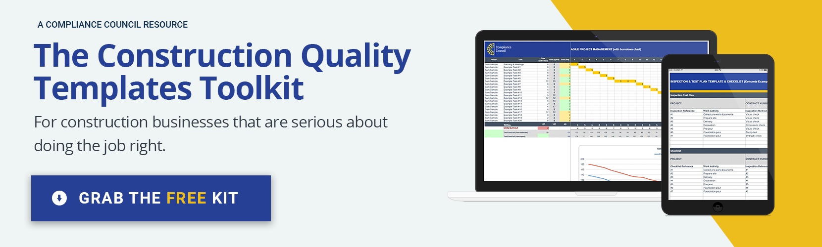
To grab your own Burndown chart template, download our free Construction Quality Templates Toolkit by clicking here:
.jpg "Bottom Form Image (2)")


